Case Study: BitSwap

BitSwap: App & Landing Page
My Role
Product Thinking
Visual Design
Interaction Design
Team
Leon Zeng - UX Designer
Alex Yu - Front-End Developer
Aryan Misra - Front-End Developer
Sigil Wen - Project Manager
Timeline
March-April 2021
How it Started
When the DeFi social platform, BitClout was launched, a group of friends decided to create the first $clout offramp, allowing users to exchange $clout with Ethereum. BitSwap was born from this user need, and I was tasked with designing the landing page and app.
Problem
Being the first $clout offramp was both an advantage and disadvantage. We were ahead of competitors, which greatly improved our chances of attracting users, but we were also held to high expectations to fulfill user needs. We needed to create a simple and efficient way to onboard users, and a landing page able to direct the users towards onboarding.
Early Wireframes
Next, we created wireframes for creating orders, and a v1 of the landing page.
Design System
When transitioning from low to high fidelity prototypes, I created a design system to ensure consistency and for all team members to have a point of reference when working on their components.
Transitioning from Low to High Fidelity
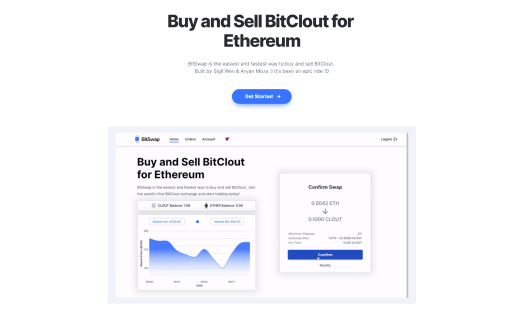
Using the design system, order layouts and profile pages were quickly made, and the project was ready to be handed off to the development team.
Final Prototypes & Launch
Using BitSwap, users were then able to connect their BitClout account, customize their profile, and deposit $clout and ETH. Creating orders was intuitive, and trading volume quickly built up, to $4 million in only a few weeks. Angel investor Dharmesh Shah also offered $100,000 for 1% of the company.
Reflections
Information hierarchy is important.
When designing the v1 of the landing page, it wasn’t as clear as it could have been for the user what they were able to do with BitSwap. In the final version, there was a clear path for the user to set up their account and get access to BitSwap.
Simplicity is best.
BitSwap had one purpose: Allow users to exchange their $clout for ETH. That was all. Originally we had many colours and interesting graphics for the landing page, as well as profile customization, but we deemed it irrelevant. The newest versions of the landing page only included sign-up and a tutorial blog, which made the page feel much cleaner and intuitive.
