Case Study: Haptiverse
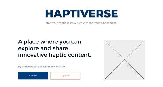
Haptiverse Project Display: Lo-fi Prototyping
My Role
Interaction Design
Market Research
Wireframing
Team
Leon Zeng - UX Designer
Wenqi Zhu - UX Designer
Mohamed Fouda - Project Manager
Oliver Schneider - Project Manager
Timeline
November 2022-February 2023
What is the Haptiverse?
The Haptiverse is an online platform for researchers, hapticians, and students to connect and share haptic material. On the Haptiverse, each haptic uploaded will have its own project page, which displays important information about the file, its creator, and its applications.
Problem
The previous iterations of the Haptiverse were not very aesthetically pleasing, nor intuitive. Users had to navigate through many pages to see all the information they needed, and as a result, would become uninterested or lost. Testers and team members agreed that a complete redesign would be useful.
New Goals
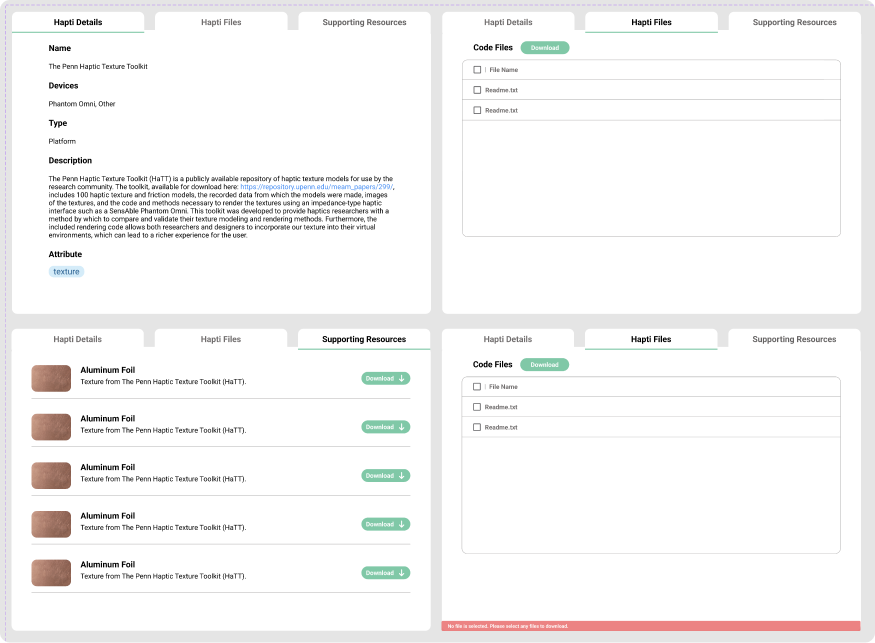
The goal of the redesign was to create a more compact, information-dense page to display projects.
Similar to Thingiverse, where each “thing” has its own explanation page, the Haptiverse wanted each haptic to have its own unique project display. In two months, the team objective was to complete a playable, low-fidelity prototype with colours.
Market Research
After establishing goals, I created a few personas for which the Haptiverse’s design should be catered towards. There were 3 in total: An expert haptician, a novice student, and a product manager.
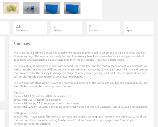
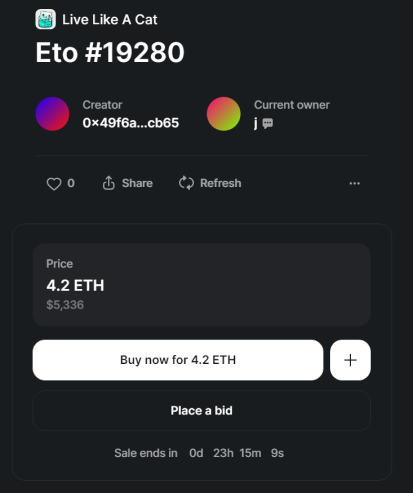
I did research on existing similar platforms, most notably Thingiverse and Rarible. There were a few common patterns I noticed.
- All important information was on one tab
- An obvious call to action (like a download button)
- Mentions/links to other users
- Usage instructions
Problem Statement
The question we aimed to answer was:
“How can we create an intuitive project page which displays information relevant to all three personas?”
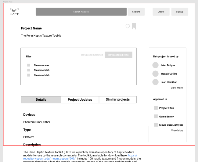
Early Wireframes
This project was one of my most educational experiences creating lo-fi wireframes and prototyping in Figma. I understood the cognitive walkthroughs better through clickable prototypes, and I began experimenting with different layouts right away.
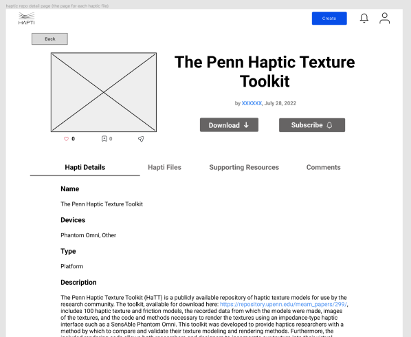
Where we are now
After many iterations, we arrived at this page. Rounded panels and accent colours helped to elevate the aesthetic elements of the page, as well as promote actionables. The design accounts for experts and novices, because extensive information is available, but not cluttered.
Reflections
This project was a great entry into prototyping. I began the project trying to create multiple high-fidelity designs and a dark mode, and wasted a lot of time when I inevitably ran into technical limitations.
Design in low fidelity first.
When I was given the freedom to explore different ideas, I would have been able to arrive at a more feasible product sooner had I decided to design in a lower fidelity.
Furthermore, after one iteration turned out to be favourable, I tunneled on it and wasted more hours.
